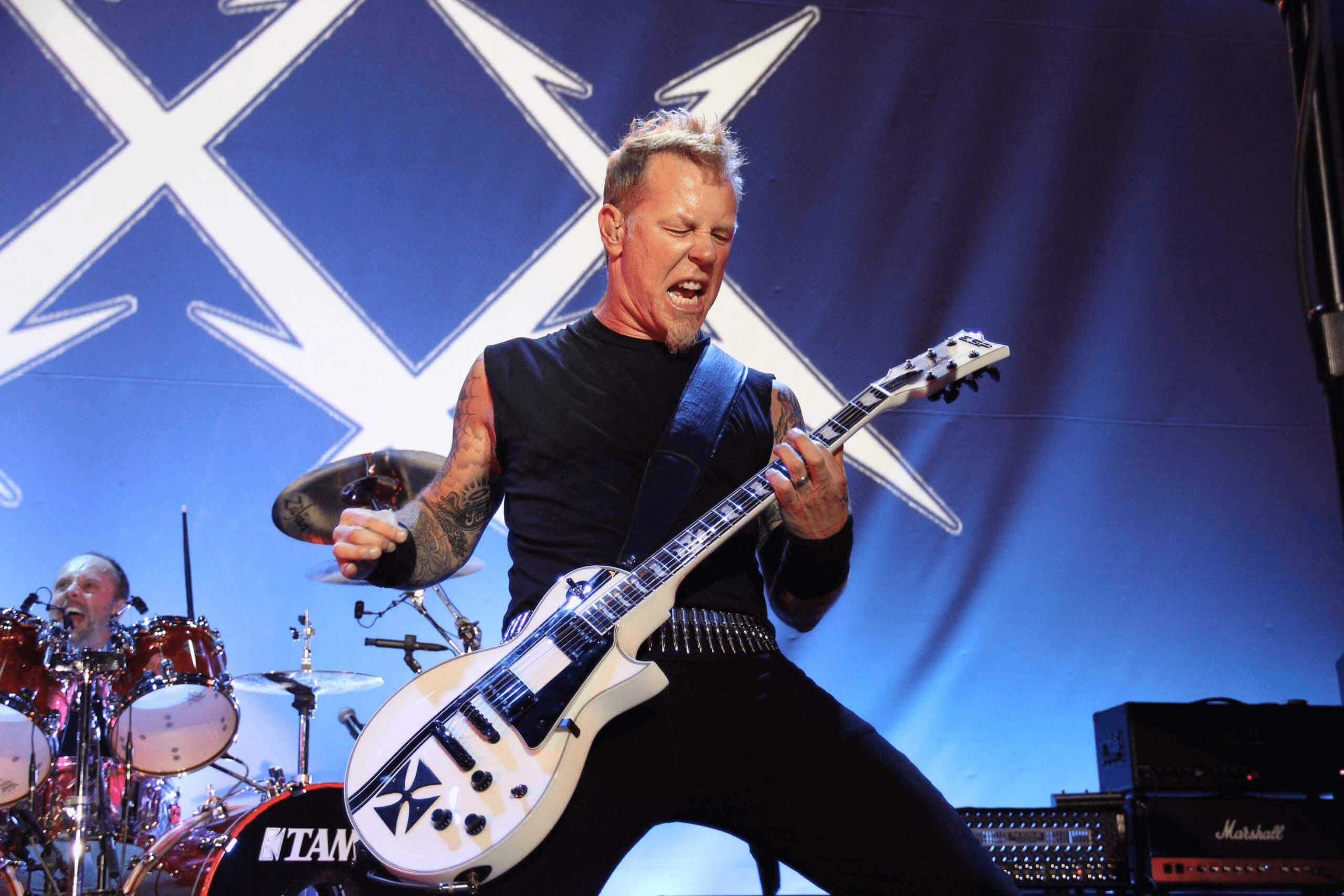
Do you want to learn everything there is to know about Metallica other than simply their iconic catalogue because you are an avid fan or are just starting to become one? So welcome to the family, and count yourself among us. While we’re not listening to the band’s classic records, we’re learning interesting information about them that we were unaware of. The history of the Metallica logo and how it all came to be during the band’s debut are today’s topics of discussion. We’ll delve deeply into who exactly designed the Metallica logo, the design process that went into it, and how the logo has changed over time, much as we’ve done with The Rolling Stones and The Beatles in the past.
Our fellow Master of Puppets, are you ready? Shall we turn back the clock and travel back to the fantastic 1980s?
Who created the Metallica logo?
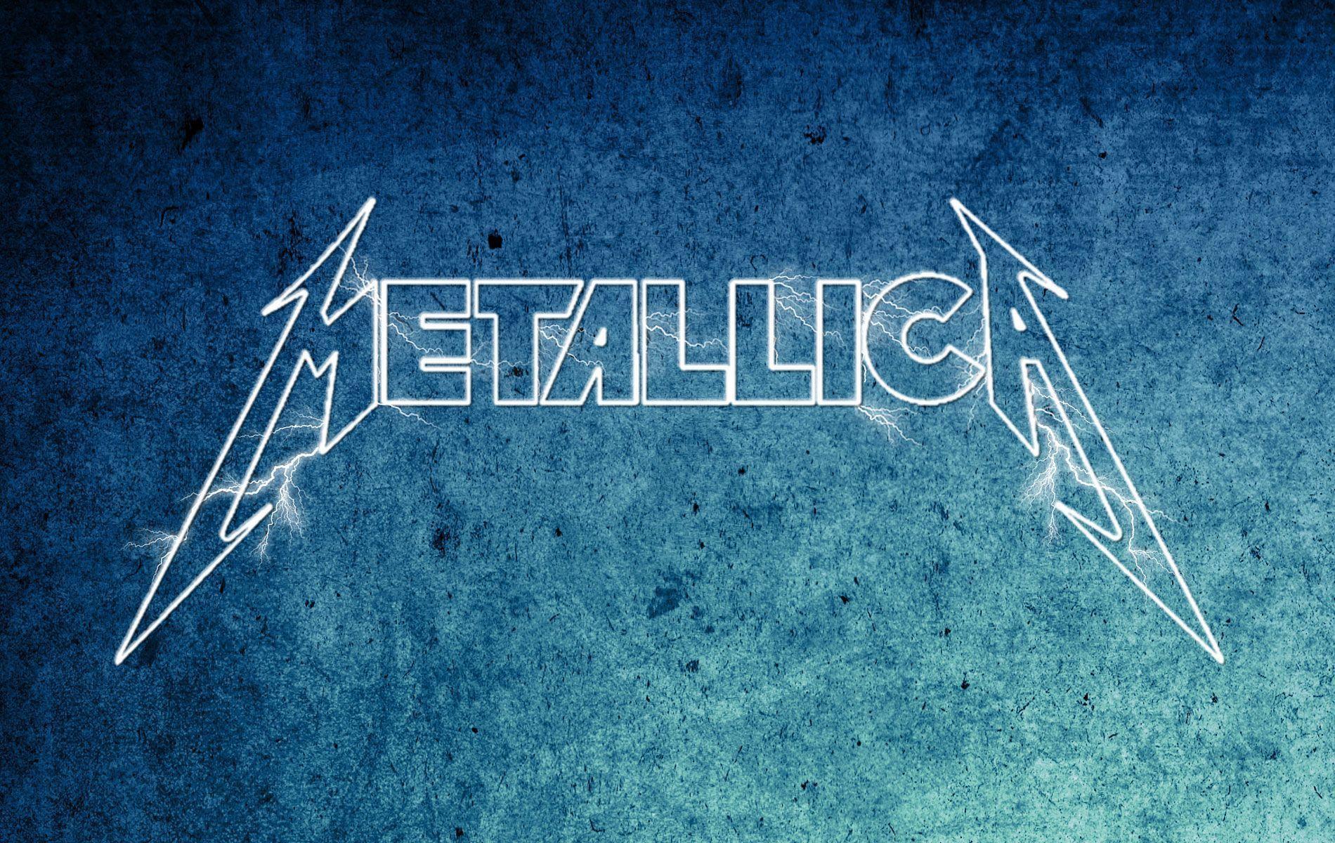
The Metallica logo was designed by James Hetfield, if rumours are to be believed. Metalheadcommunity.com reports that Hetfield took art classes in high school and used his newly acquired abilities to create a promotional sketch for the band’s early live shows. Hetfield designed the name/logo to where the letters “M” and “A” in Metallica were more extended than the rest, giving birth to an iconic invention. The band began using the original logo in 1981, with its first formal appearance on the cover of their 1983 debut studio album Kill ‘Em All. The evolution of the Metallica logo may be traced back to that point.
Metallica’s Logo Through the Years
Metallica’s emblem has changed several times over the years, similar to those of many of their contemporaries. Here’s a rundown of a few of the many possibilities.
Logo no. 1 (1983 – 1996)
The original version, which included the M and A extended into lightning bolts, is still widely used today. The band experimented with 3D shapes and other visual elements to create unique album covers for albums like Ride the Lightning and Master of Puppets, but the basic logo stayed the same across all of their releases. This lineup of Metallica would remain in place from 1983 until 1996.
Logo no. 2 (1996 – 2003)
Between the years 1993 and 1996, Metallica used a much simpler, less obtrusive font. Although the “M” and “A” were still more extended, the lightning bolts were no longer there. This is our least favourite form of the logo because it took away the Metallica personality reflected within it. The original design had the feel of a genuine rock band’s emblem. However, it seems like nothing more than words on paper (although the headband logo was quite neat).
Logo no. 3 (2003 – 2008)
Finally, we’ve reached an understanding! The emblem that was in use from 2003 to 2008 was far more recognizably “Metallica,” with its flaming letters. This logo revived the band’s character and energy, and it looked and felt like it belonged to not just any rock band but one of the greatest of all time.
Logo no. 4 (2008 – present)
And in 2008, Metallica went retro with an improved take on the band’s 1981 look. The extremely stretched “M” and “A” and electric lightning bolts were both returned. In its most basic form, this logo is Metallica as we all first encountered and fell in love with them. Since Metallica hasn’t updated its logo in over fifteen years, we can only assume that they agree that the current design adequately captures who they are. Always Metallica.